
The Enshittification of Basically all Digital Design. But in this Case, Specifically, the Slack Redesign.

So Slack redesigned their app. I'm a member of 6 different Slack workspaces. Here's what the left hand nav bar used to look like:

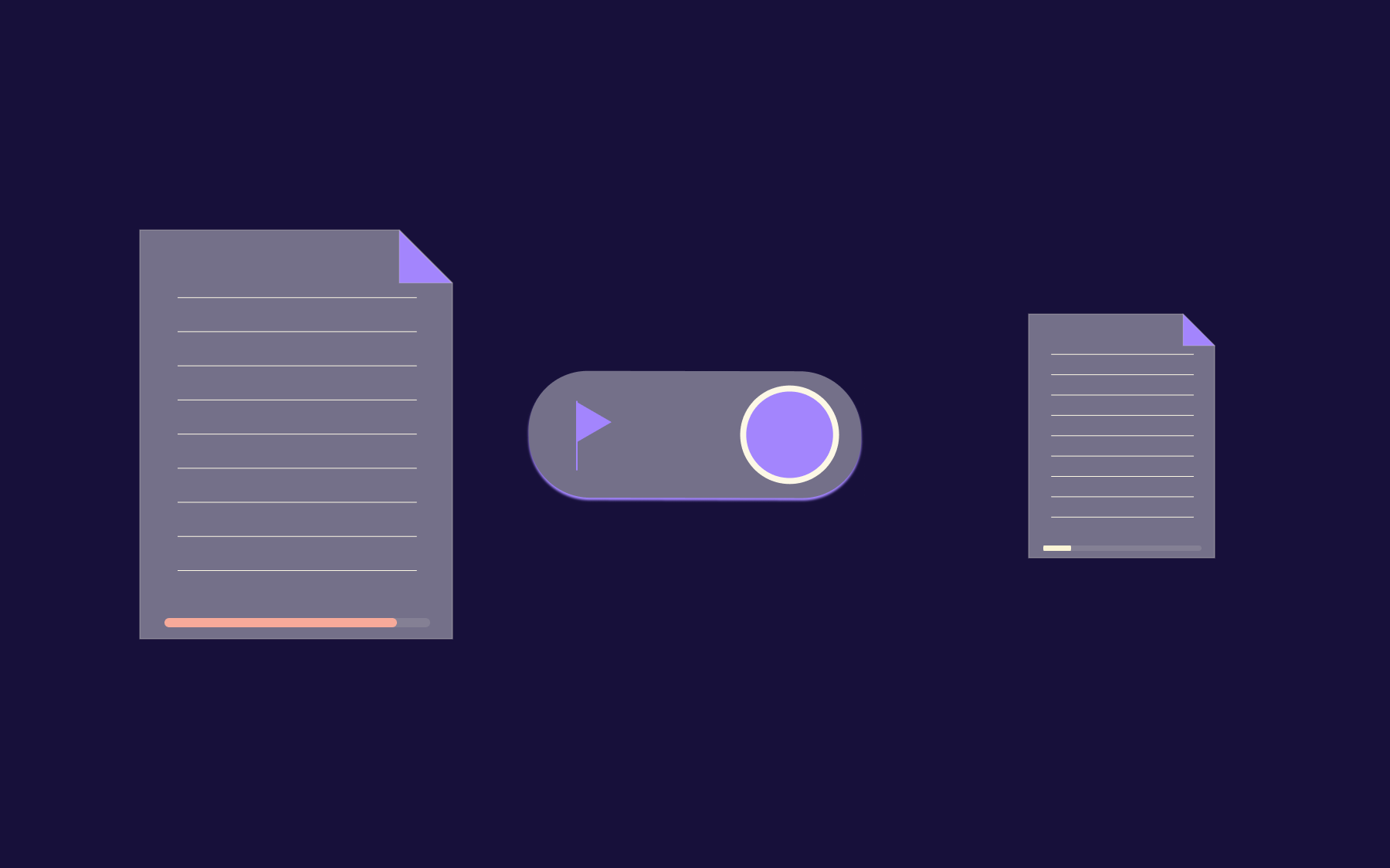
And what it looks like now:

Eagle eyed readers who have multiple Slack workspaces will most likely know where this is going! But for everyone else, here's the problem. In the old Slack design, I knew exactly which workspace had unread messages. To get to the next unread message, across all my workspaces, I just did CMD+number to jump to the workspace, then CMD+T to get to the next unread channel.
One of my workspaces got upgraded to the new design this morning. At first I thought the removal of the Workspace icons list on the left hand nav was a bug or glitch, but after chatting with the Slack support team (who are great, btw!) I realised that this is my new life. I have to now click with my mouse on that small Workspace list icon, then inspect which workspace has the unread message, then click that workspace, then find the channel that has new messages.
I do this about 300 times a day.
Firstly, this is just a massive UX failure. Whoever did this work at Slack clearly didn't talk to anyone who uses multiple workspaces. Which I would guess is a LOT of Slack users. Apparently there's are things called "Grid" accounts which you get if you pay Slack $50k+ a year (apocryphal figure, but probably accurate) where you can view channels across workspaces, but given that we don't pay Slack that much, we can't use that. There's no option to show all the workspaces in the left hand nav, and there's no keyboard shortcut to jump to the next unread channel across workspaces.
So here's where the rant is going to start.
My Slack life is now 300 design papercuts a day; reaching for my mouse 300 times a day more than I used to. The kicker is that there’s still enough space in the new left hand nav to show all my workspaces! But no. They have been sacrificed at the altar of some design spacing ideology. Then the cherry on top is that they have been replaced with “DMs, Activity, More” icons which I will never, ever click in my whole entire life because I don’t care about these things. Slack: Your design paradigm was set many, many years ago. You’re stuck with it, sir!
I can’t remember the last time a muggle said to me:
"Hey, I see [FAANG type company] just resigned [app with 100M+ MAUs]. I love this design - it's so much better than the old design. It's way more intuitive. I get around the app way quicker nowadays!".
In fact, come to think of it, I’VE NEVER HAD THIS CONVERSATION WITH ANYONE, EVER.
But I swear to God I have the following conversation twice a month, usually when I see someone I haven't caught up with for a while, and because I work in tech and they probably think I'm a "web designer" because that's just what a lot of people think. Even my Dad.
"OMFG HAVE YOU SEEN THE NEW [app with 100M+ MAUs] FROM [FAANG type company]? THEY MOVED EVERYTHING AROUND! I CAN’T FIND ANYTHING NOW! WHY DO THEY HAVE TO REDESIGN THE ENTIRE APP EVERY 2 YEARS!?! THIS IS ALL YOUR FAULT ETC ETC BTW YOU WORK IN COMPUTERS PLEASE CAN YOU HELP REINSTALL MY PRINTER DRIVERS KTHX"
Does this conversation just never happen to people in the valley? Maybe there are no muggles left in the valley? Here's a pretty good rule that I think would stem this constant enshittification of digital design.
Unless you absolutely, positively, 100% need to update the design structure, workflows or overall usability of your product, don't.
Here's some reasons you might THINK would satisfy this rule. But they REALLY DON'T:
- You raised $200MM right after Covid and have a team of 30 designers all on $250k+ with nothing to do. Because they designed the app once. AND YOU ONLY NEED TO DESIGN IT ONCE.
- You added a bunch of new features to your product that you thought were great ideas. Turns out no-one cares about them. You think it would be a good idea to shove them in people's faces every day to see if they stick.
- You or your team are 'bored' of the current design and think it's time for a redesign.
- You're trying to juice your numbers/session time/engagement/some other terrible metric and think that this is the best way to do it.
Here's a design philosophy: IT'S PRETTY MUCH NEVER TIME FOR A REDESIGN. NO ONE WANTS YOU TO REDESIGN YOUR APP APART FROM YOUR DESIGN TEAM. I DON’T CARE WHAT DIETER RAMS THINKS. OR WHAT HIS RADIOS LOOKED LIKE. I DONT WANT THINGS TO HAVE SPACE TO BREATH. JUST LEAVE IT ALONE.
And Slack, if you’re reading: Please give us the option to revert this. Thanks Slack. Go on, you know you want to.


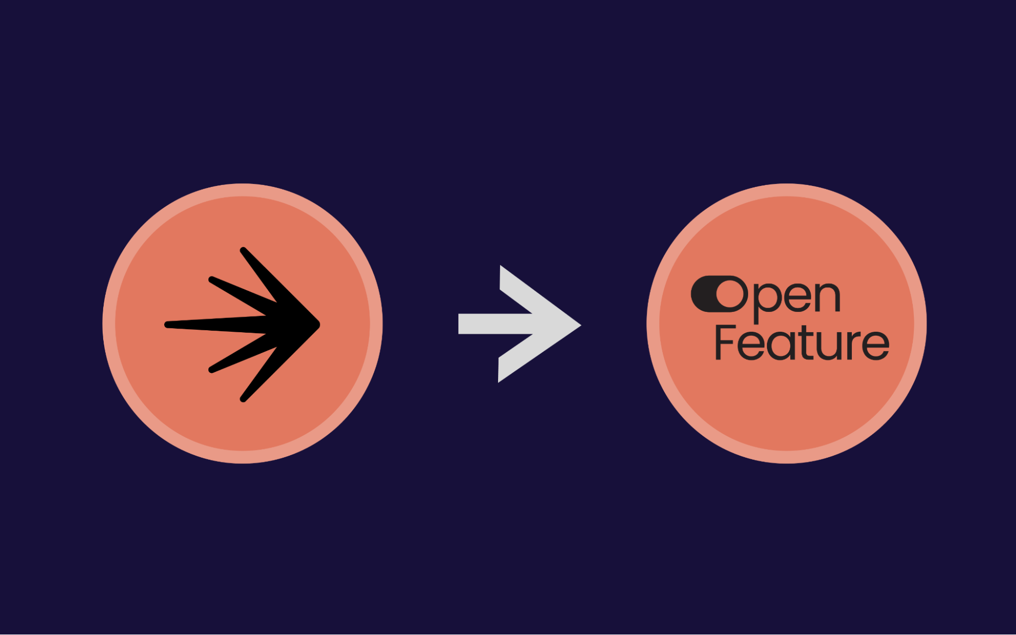
OpenTelemetry, without the vendor lock-in: Introducing full observability for Open Source and Self-Hosted Flagsmith customers


.png)
.png)

.png)

.png)


.png)


.webp)